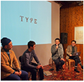
“TYPE” a Glasses Brand Inspired by Fonts
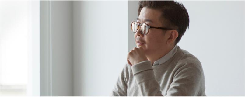
Interview with Tota Hasegawa, Wieden+Kennedy Tokyo
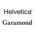
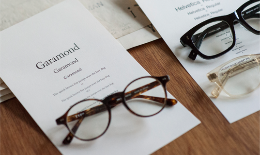
Oh My Glasses, an online shop specializing in glasses and sunglasses that’s now attracting attention, launched a font-inspired glasses brand in collaboration with creative agency, Wieden+Kennedy Tokyo. Their very first line of products, “Helvetica®” and “Garamond,” have just been released from the “TYPE” brand. We interviewed Tota Hasegawa, Executive Creative Director of Wieden+Kennedy Tokyo, to talk about the concept and background of this brand and other stories about fonts.
Interview : Yuki Harada
- Tell us what led you to create the TYPE brand.
-
Hasegawa : I wear glasses every day and I’ve always thought that the experience of choosing glasses could be improved. When you try on glasses at a store, store clerks are looking at you and you feel uncomfortable. Sometimes you like a pair of frames but they don’t come in the color you like, or you try on a pair and they just don't look good on you. I was thinking it would be nice if you could choose glasses just like you pick a font when you are designing something. Kiyokawa-san and Mutobe-san of OMG have already been exploring new ways to distribute glasses and we decided to create a new glasses brand together.
When we were brainstorming ideas as a team, we looked at lots of portraits of people wearing glasses. We discovered that a lot of graphic designers wear glasses and there seems to be a common thread between the characteristics of their glasses and the style of their work. For example, a designer who creates delicate designs wears thin-framed glasses (laugh). This made us realize that the role of fonts in graphic design is similar to the role of glasses. Glasses are functional products, but there are many different types of glasses and they all give different impressions. In a similar manner, when we are communicating a message, the choice of font greatly affects the way the message is communicated. The balance of practicality and style is similar and we found it interesting. That’s how it all started. - It’s interesting that TYPE provides three types of thicknesses for frames, “Bold,” “Regular” and “Light,” like the weight of fonts.
-
Hasegawa : Like the thickness of a font, the thickness of a frame is an important element in choosing glasses. In fact, the shapes of frames look like parts of alphabetical characters. A subtle difference in the stroke makes a big difference in the impression of the person who wears the frame.
One of the things I’ve experienced when I was choosing glasses for myself is that I’ve come across frames that were a little too thick or too thin though I liked the shape. But you can’t get a thinner frame in the same style. In this sense, TYPE can provide a new, different experience in choosing glasses. - Why did you choose “Helvetica” and “Garamond,” as the first lines of products to be launched in this series?
- Hasegawa : As the very first models to be released, we wanted to choose shapes that allow many people to use the products without feeling uncomfortable. Helvetica is one of the most basic fonts, so we thought we should include it. Because Helvetica is a sans-serif font, we wanted the other one to be a historic serif font. That’s why we chose Garamond. Helvetica and Garamond are both based on two of the most standard glasses frame designs, “Wellington” and “Boston”, which we thought was a perfect juxtaposition for our first models.
- How did you design the products?
- Hasegawa : We worked with an eyewear designer. We prepared a document outlining the historical background, characteristics and culture of each font for the designer so he could use it to design the shapes of glasses. We reflected the shapes of the fonts in the details of the frames, but there is a limit to what we can incorporate in the products. We communicated back and forth many times in an effort to achieve the right balance. It was quite difficult, because everyone had a different image of Helvetica, and it’s only the first product we’ve made so far. (laugh)
- Tell us your image of Helvetica and Garamond.
- Hasegawa : Helvetica is a very neutral font. If you compare it to clothes, it’s like a white T-shirt you put on when it’s hard to decide what to wear. I think it’s a font you use when you want to communicate something a bit serious or logical. It’s used for logos of companies like banks and airlines. On the other hand, Garamond has a bit of a grown-up feel and is full of wit. The image I have is that it’s a font you use when you want to get a message across. The Apple Macintosh logo is a good example. I guess I choose fonts as if they are clothes that match the things I want to write or express. So what kind of image a font projects is more important to me than how beautiful its shape is. For example, I would think it might be interesting to use a textbook font to write something a bit silly, or I would choose a casual font when I’m embarrassed to write something serious.
- Have you always been interested in typography?
- Hasegawa : I haven’t focused just on typography, but I’ve always been interested in it as an element of design. For example, if someone is consistently using a completely different font when everyone else is using Helvetica, I feel that person is being aggressive. It’s interesting that there are trends with fonts. When the logo for the 2012 London Olympics was announced, it was very unpopular. However, designs and cultures inspired by the 80s became popular around the Olympic Games and the logo actually turned out to match the time. When the logo was first announced, many designers uploaded their own designs on the Internet to show how they would have designed it, which shows that logos and fonts are something that a lot of people react to and also reflect the times.
- You were working in London for a long time. Do you see any difference between Japanese fonts and western fonts?
- Hasegawa : When I went to Denmark, I thought the fonts and signage were so beautiful everywhere I looked. I found signage at airports in Northern Europe were also beautiful. On the other hand, signage in Japan gives a messy impression. It’s because Japanese characters and western characters are used together. It looks cleaner and more well-organized when only the English alphabet is used. I think this has a lot to do with the fact that overseas designs look cool for some reason. The English alphabet is highly symbolic and design-oriented, whereas Japanese has many different scripts. Kanji (Chinese characters) have their roots in hieroglyphics, so I think the design philosophies are completely different.
- Is there a beauty unique to Japanese fonts?
- Hasegawa : I love rakugo (Japanese comic storytelling), so I see lots of yosemoji (traditional Japanese fonts used for rakugo). Rakugo started as a popular entertainment and back in the day people who couldn’t read would go to see rakugo to get news. In consideration of these people, the yosemoji fonts were designed in such a way as to let people recognize the shapes of characters. For example, some people couldn’t read the name of the performer, “古今亭,” but visually recognized the order of characters and understood that this person would be performing that day. In a way, they recognized these characters like the logo of a company or a brand. I think this is an interesting aspect that’s unique to kanji.
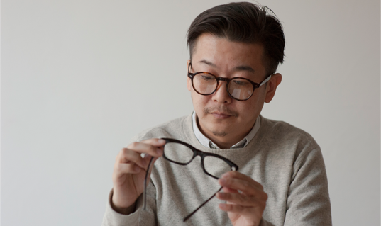
- By the way, when did you start wearing glasses?
- Hasegawa : When I was past 30. I always thought I had good eyesight, but one day I realized I had bad eyes (laugh). I started to wear round frames like these about four years ago. I saw round frame glasses at a vintage shop in London and I put them on just for fun, but they looked nice to my surprise (laugh). I think round frames give a softer impression than rectangle frames. I have four round frame glasses including sunglasses and they all look very similar to “Garamond” that we’ve just released. It’s not that I made specific requests, though (laugh).
TYPE Q&A
- Q. Tell us your three favorite fonts.
- A. Universe, Lisbon, Monaco
- Q. Is there any product you bought because of typography?
- A. German stationery.
- Q. If you were a font, which one would you be?
- A. Chicago
- Q. If you were to write a will, which font would you want to use?
- A. Osaka
- Q. What does typography mean to you?
- A. Culture.

Tota Hasegawa
Hasegawa was born in Tokyo in 1972. He completed his master's course at the Royal College of Art (RCA) in 1997. Following graduation, he worked at institutions such as the Sony Design Center and Sony CSL Interaction Lab. In 2000, Hasegawa entered the London-based design collective, TOMATO. Since 2011, he has also been employed by Wieden+Kennedy Tokyo as Executive Creative Director.