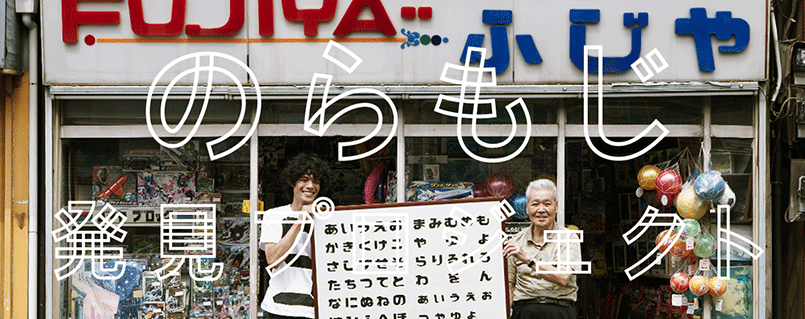
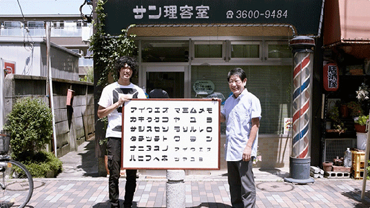
“The Stray Serif Project” is an unprecedented initiative that’s now attracting attention. It gave a name, “noramoji” or “Stray Serif” to unique, interesting yet unsophisticated characters that exist unnoticed all over the city. The project members don’t just appreciate these characters, but turn them into data as original fonts and distribute them to people. They also created a process whereby sales of the font data and original products generated by the stray serifs are returned to the people who found them. The project has provoked much online debate, and we interviewed project founder Rintaro Shimohama, to hear some behind-the-scenes stories.
Interview : Yuki Harada
-
Q: Tell us how “The Stray Serif Project” started.
-
Shimohama: I started “The Stray Serif Project” with Shinya Wakaoka, a freelance graphic designer, and Naoki Nishimura, who belongs to tha.ltd. It was originally Shinya’s personal blog where he introduced interesting typography he found on the streets. As a designer, I’ve always been interested in typography and I also like street observation, like “Thomasson” by Genpei Akasegawa. I’m sure people like graphic designers and art school students have taken photos of the designs they’ve found on the streets in one way or another, but we started to think it would be nice if we could turn it into something that would make more people interested in it. That’s how it started.
-
Q: How did it evolve into the current format?
-
Shimohama: When I first approached the other guys to start this project, the only idea I had was to create original Japanese fonts based on characters from the signage we find on the streets. Each of us made practice pieces and we brainstormed ideas to develop this into a bigger project. We came up with ideas such as creating stickers and giving them to the store we got the characters from, or using the font we’ve developed to create posters. However, we didn’t just want to show the beauty of the graphic. We wanted to make our project relevant to people who aren’t even interested in design and that’s why it has evolved into the current format.

-
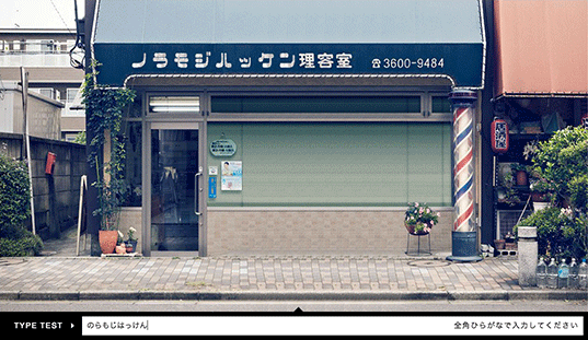
Q: Can you tell us more about the interface you created to allow users to try the font on a photo of the original signage?
-
Shimohama: We wanted to put some entertainment value into our idea of creating Japanese font sets from signage, in the hope that we could spread awareness of the project to a broader audience. If you just want to type characters into the interface and have fun, that’s fine. Or if you want to know more about the project or learn more about the fonts, you can also read the articles about each store. That’s how the traffic flow of our website is designed.
-
Q: Now you have 9 types of fonts on your website. What are the criteria you use to choose fonts?
-
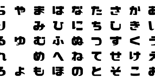
Shimohama: The three of us walked around different neighborhoods of Tokyo where you can still find many mom-and-pop stores with old signage. We took pictures and determined which fonts were interesting based solely on our personal taste. The ones that were just hand-written and casual weren’t that interesting. We chose fonts that were unique from among the ones that were designed to some extent but not too much. Then we thought about the balance so we wouldn’t have too many similar fonts. Once we decided on the type of interface for the website, we narrowed down the fonts so they would fit the interface nicely. The most important point was whether the store owners would cooperate with us. We couldn’t use some of the fonts because the stores didn’t want us to use pictures of their stores.

-
Q: Is there a clear definition of “Stray Serif”?
-
Shimohama: We don’t have a clear definition (laugh). To us, it’s just fonts on the signage of old mom-and-pop stores that aren’t widely known, as opposed to the ones used for the logos of chain stores that you see everywhere. Logos of chain stores are nice when I see them as designs, but I feel uncomfortable when the entire city starts to be filled with those logos. Today we see more shopping malls in the suburbs and mom-and-pop stores are going out of business rapidly. We felt sad that the cityscape that used to have a wide variety of stores has now become uniform.
-
Q: If you make the entire Japanese font set by just using the original signage, would the finished font vary greatly depending on the designer’s interpretation?
-
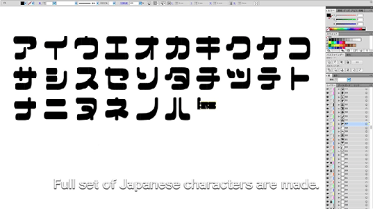
Shimohama: Yes. Shinya gave directions for font production and we made each font with the cooperation of multiple designers. When we had only a few characters to refer to from the signage, the font was highly dependent on the designer’s interpretation. There are so many characters in Japanese that are distinctively unique. It looks like there should be a rule for how each stroke should be created, but as it turns out, there aren’t any. It’s as if they’re all “stray serifs” after all (laugh). After having understood all that, it’s fun to think about how we design the shape of each character. But compared to the process of looking for characters on the streets, creating a font is more like spiritual penance (laugh). When we showed the finished fonts to people at the stores, many of them were happy and said “it must have been a lot of work!”

-
Q: You ask for contributions when people download a font, and sell original T-shirts using the fonts. Why did you want to create a system where you give money back to the people at the stores who provided the stray serif input from their signs?
-
Shimohama: When we think about what we really want to achieve with this project, it’s to attract people’s attention to interesting typography and help stores stay in business, so that the signage will also stay. After the site was launched, some people criticized the system that gives money back to the store owners and not the people who created the fonts. We understand that it’s fair to pay money to the people who made the signage and we respect the people who designed the fonts, but our intention is to help these fonts continue to exist. To that end, we think it’s best to give money back to the people who take care of the signage now. We interviewed the store owners whose signs have been used because we wanted people who got interested in the article to go to their store and buy products and spend money there.
-
Q: What do you think about the name, “noramoji” (stray serif)?
-
Shimohama: There are many other projects that feature retro characters around the city, but to our surprise, we didn’t find anyone who has given a name to refer to these characters collectively. We wanted to create a name you can use when you try to search these characters on the Internet and also make the name well-known. We used the phenomenon of unique but badly designed Japanese mascots that people call “yurukara” as a reference point. Many of these mascots are ridiculed for being badly designed, but eventually this un-designed aspect of the mascots makes them more endearing. In the same way we wanted a word to refer to the unique fonts we found around the city.

-
Q: I’m sure you’ve observed lots of different reactions to the project. Is there anything that has surprised you in the reactions?
-
Shimohama: Many people have seen our project and one of the comments we’ve received was that it looks like a folk-craft preservation movement. I believe this sort of movement promotes the idea that we shouldn’t just praise work created by famous designers and craftsmen because there are many exceptional works made by unknown people. I felt that our project could be similar to that. However, Japanese fonts function only when all of hiragana, katakana and kanji are used, so our project may not have reached the level of true folk-craft. We have considered including western characters when we were still in the production stage, but most of them ended up looking pretty uncool (laugh). I don’t know if we felt that way because we are Japanese, or if it’s because of the unique characteristics of the Japanese language.
-
Q: Are you going to continue to add new fonts?
-
Shimohama: Yes, we’d like to. Because our project is becoming more and more well-known, we want to find people who want to try it in their own city and work with them. I think it’s pretty fun for anyone to look for characters all over the city. When you are walking around searching for “stray serifs,” the familiar cityscape starts to look different. I want to hold a workshop to let participants create fonts on their own based on characters they find. There are many things you discover when you actually use your hands and do something yourself. Also, it would be nice if designers could use the “stray serif” fonts to create graphics or products someday.
URL:
noramoji.jp

Rintaro Shimohama
Born in Tokyo in 1983. Graduated from Kanazawa College of Art. Interactive art director.
Shinya Wakaoka
Born in Ishikawa in 1982. Graduated from Kanazawa College of Art. Freelance graphic designer.
Naoki Nishimura
Born in Hyogo in 1984. Graduated from the Department of Graphic Design, Tama Art University, in 2011. Designer at tha ltd.
