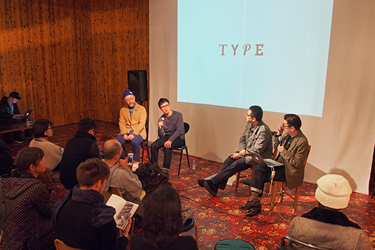
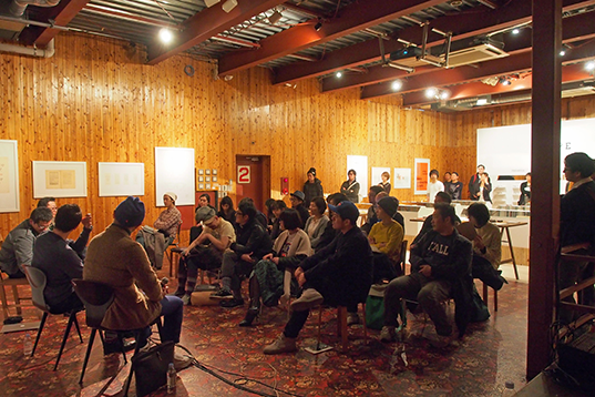
The “TYPE Pop-up Store” ran for three days from January 30 to February 2 at Vacant in Harajuku and two talk shows were held there over the course of the weekend. This is the first of two reports about the event.
Interview : Yuki Harada
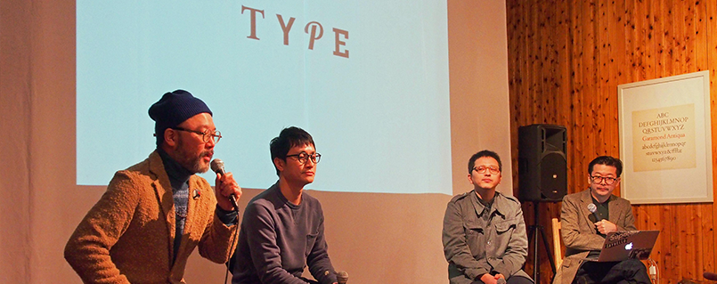
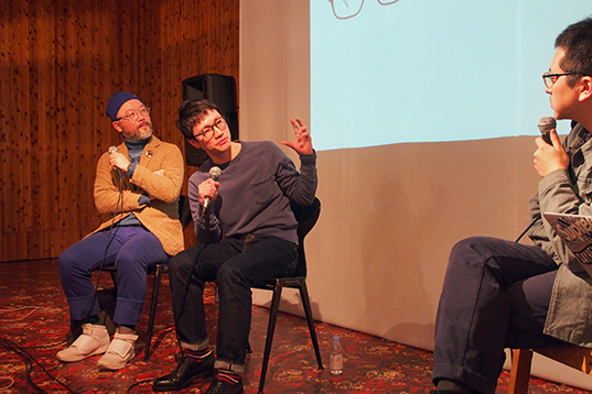
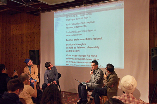
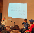
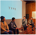
On the first day of the talk event, members of the panel discussion were: Tota Hasegawa of Wieden+Kennedy Tokyo who launched TYPE with Oh My Glasses, So Hashizume, a graphic designer who has a wealth of knowledge about typography/fonts, as well as the two eyewear designers who worked on TYPE, Ikuya Enomoto who designed the Garamond model, and Hideto Moriyama who worked on the Helvetica model.

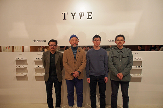
(From left) Hideto Moriyama, Ikuya Enomoto, So Hashizume, Tota Hasegawa
Tota and So graduated from the Royal College of Art (RCA) in England. They are friends as well as collaborators, and both worked as facilitators for Human Practice, a creator development program that was conducted in 2013. Tota thinks that the idea for TYPE might have been born back then.
Tota: Every time we had a meeting for Human Practice, So was always wearing black framed glasses and I was thinking they suited his character very well (laugh). The concept for TYPE comes from our discovery that there’s something in common between the glasses a graphic designer is wearing and the designs he creates. Looking back, I might have got inspiration from So when we were having meetings.

Ordinary fonts and ordinary glasses
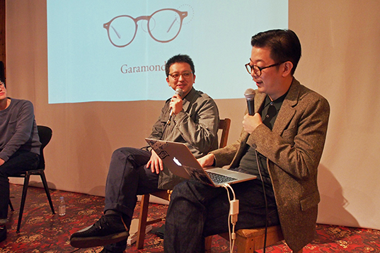
When the conversation shifted to the actual design of TYPE, Ikuya, who worked on its design, said “I thought it sounded like an interesting project when I heard the concept of applying the characteristics of a font to glasses. But it was very hard to bring those characteristics to life whilst expressing what Tota calls ‘ordinary’.”
Because the role of a font/typeface is to communicate a message, it has to be legible and universal. In other words, these qualities need to be perceived as “ordinary.” The key to designing glasses for TYPE was to find a way to bring this “ordinary” feeling to life.
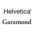
Tota: Helvetica and Garamond are two of the most standard typefaces, so it was like going to a barber shop and asking for an “ordinary” look (laugh). With Helvetica in particular, if you design it too much, it’ll no longer be Helvetica. But the reason these fonts feel ordinary to us might just be because they look so familiar. Also, what’s ordinary is different for each person. That was the most difficult part and we communicated back and forth many times.
Ikuya: With glasses, what’s “ordinary” changes with the face of the person wearing them. For example, for French or British people whose faces have well-defined features, thick frames look ordinary, whereas glasses with thinner frames look natural for Japanese people.

So Hashizume uses a variety of fonts every day as a graphic designer and commented “it’s interesting that they have prepared three different weights and have applied typeface design to eyewear design.” Ikuya added that “in the world of eyewear design, the frame thickness usually depends on the designer’s personality or the tone of the brand and therefore it’s rare for a brand to intentionally make different thicknesses for the same line of frames.”
Achieving a good balance between practicality and style is the key to both typefaces and glasses. Having brought the two together successfully, the future of TYPE products seems to hold great potential. Tota even came up with an idea that “because the distance between the eyes is different for the Westerners and the Japanese, it would be nice if you could adjust the size of your glasses online as if you were kerning, and then place an order.”
So: Unlike glasses, a typeface isn’t of any value on its own. It becomes valuable only when it’s used to type characters. For example, fonts are used for graphics on T-shirts. You can brag about owning a T-shirt, but owning a font isn’t something you can brag about (laugh). A font itself is not a fashion item, but you can say fonts are fashion. They are interesting media.

Uniqueness born from being ordinary
For “TYPE,” we didn’t design the glasses by just using the shapes of the typefaces as motifs. We tried to design based on our understanding of the historical background and culture associated with each of these typefaces.
Hideto: There is a frame design called Wellington which looks like upside-down trapezoids from the front. From the very beginning, I had an image in my mind that Wellington would be the basis of our design if we were to create Helvetica-inspired glasses. It’s not that Wellington has the same shape as Helvetica, but we used the shape that can be considered as a standard in eyewear design and designed a frame that’s close to American Wellington that I especially like.
On the other hand, it’s only natural that for the classical-looking Garamond, we chose Boston, which is close to the original form of glasses.

It’s interesting how these glasses have “somewhat distinctive shapes” as Tota puts it, despite the fact that classic typefaces were applied to standard eyewear designs. On this point, So Hashizume gave us some interesting examples from a book titled “Helvetica Forever.”
So: Helvetica is a widely used typeface today. What I’m interested in is what kind of cultural background it has and how it’s been used in the world. While it has become an almost neutral typeface now, there are many designers today who try all sorts of things with it.
So introduced us to four kinds of typefaces that are referred to as Helvetica clones: “Neutral,” “Haas Unica,” “Replica” and “Union.”
Neutral

A typeface created by quantifying the characteristics of a wide variety of typefaces that exist today and using their average values. “The intention was to eliminate unique attributes, but it’s interesting how it looks very unique when written in bold.”
Haas Unica

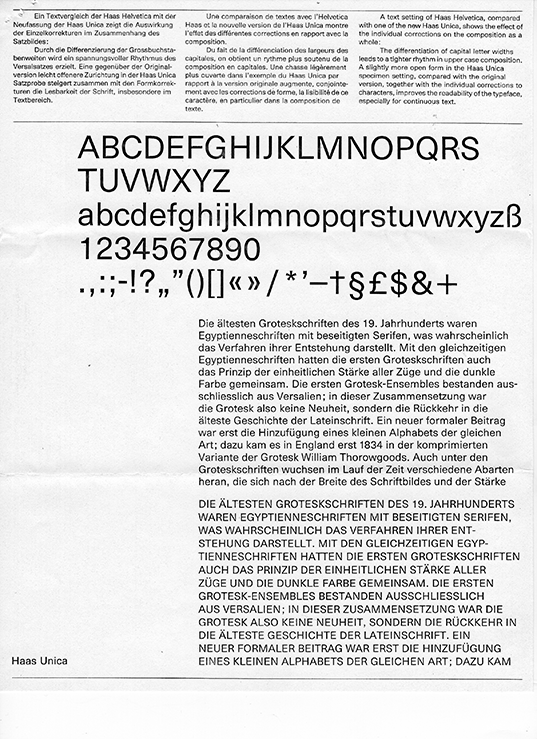
Haas Unica was developed with the objective of creating a neutral typeface like Helvetica. “This font is no longer available today, but I once designed a book using it when my college professor at the time owned the font set. It’s very easy to design with and I’d love for it to become available again.”
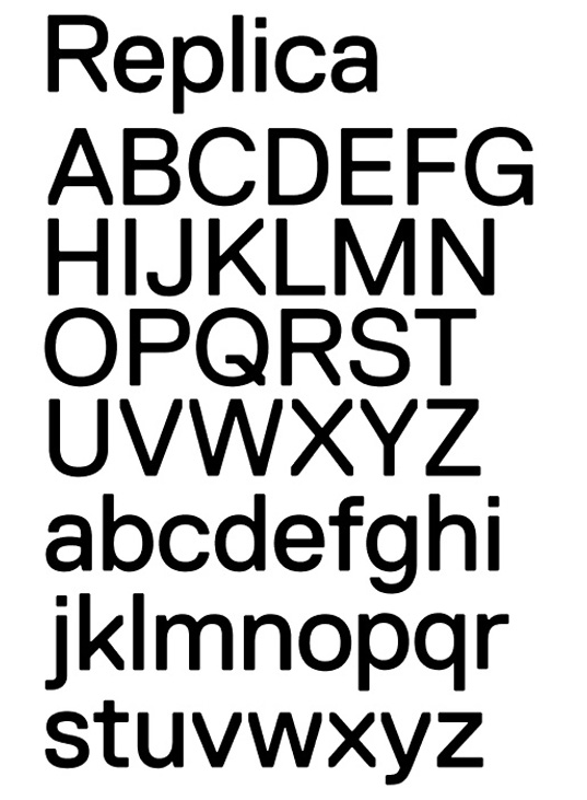
Replica

This is a typeface designed on a rough grid 10 times the size of the grid that was used to design Helvetica. “If you compare it to music, it’s like creating a track that samples all of James Brown’s breaks. It’s like when a homage to an original work gives birth to something new.”
Union

Union was created by combining Helvetica with Arial, a typeface that was developed as an alternative to Helvetica. “When it comes to this level, it’s like ‘spot the difference.’ I can imagine the designer who made this font gloating over such a reaction (laugh).”
A variety of topics came up around the relationship between typefaces and glasses. At the end of the talk show, one of the audience members asked what’s happening with TYPE going forward.
Tota: We noticed there are few websites overseas where people have been speculating half-jokingly if we would make “Comic Sans” (laugh). Comic Sans is an uncool font that looks like handwriting. Someone used it to create a parody of TYPE and posted it online. Someone else designed and posted an italic version of the Helvetica model. We want to see those kinds of interesting reactions and ideas on the Internet to get inspiration and think about what we’ll do next.

